
Robert Cottingham is known as a photorealist, but his meticulous paintings and drawings of pre-digital Americana border on abstraction. Cottingham depicts mid-20-century signs, typefaces, manual cameras, railroad boxcars, and mechanical components, or what he has called “tools of the Everyman,” in various dynamic compositions with intensified color and light. The artist has described his fascination with signs as originating from trips to Times Square as a child: “I think that’s when the seed was planted, when I saw the kind of activity going on above the ground level.” Obsessed with the precise geometry of his subjects, Cottingham’s process incorporates a series of steps that can include sketches, photographs, shapes mapped onto grids, and model construction. His crisp, often-monumental canvases celebrate and accentuate the forms of his subjects while remaining devoid of nostalgia. He lists Franz Kline, Edward Hopper, and the New Realists among his influences. His primary interest lies in the subject matter — the so-called Americana.

From Karl Hecksher who worked with Cottingham on the project
“I’ve had the pleasure of working with many wonderful Artists over the years. While I’m tempted to share with you my personal experience with each Artist, I realize how much we all have in common; a desire to make the best prints possible.
Usually I work directly from an original painting the Artist makes available to me. I like to build the image in a similar manner that the Artist has constructed the painting. It really is all about color, the touch, the integrity of the mark, and the painters palette. After careful observation of the Artists intentions, I begin the process of making color separations.
I carve all the wood blocks by hand. Some blocks are printed several times and may have more than one color. An understanding of the interaction of wood, pigment, and layers of color is important.
I print all the prints by hand without using a press. Editioning a print is a choreography of repetitive movements to perfection, a meditation on the Artists work.
I hope you will one day have the pleasure of viewing a print I have made and letting it speak to you.
K.H. 2009
A retrospective of Cottingham’s work took place at the Smithsonian American Art Museum in 1998.
and These woodcuts are in the collection of the Smithsonian American Art Collection
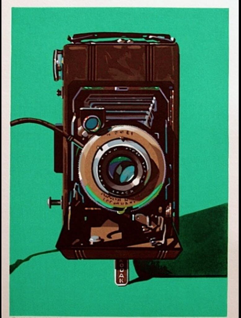
Bimat
2000
Wood Blocks Printed on hand made Japanese paper.
Hand Printed by Karl Hecksher in 20 colors, using 13 blocks and 24 printing steps
Edition of 35.
Diomatic
2000
Wood Blocks Printed on hand made Japanese paper.
Hand Printed by Karl Hecksher in 25 colors from 12 blocks.
Edition of 35

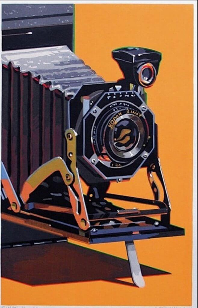
Hawk-Eye
2000
Wood Blocks Printed on hand made Japanese paper.
Hand Printed by Karl Hecksher in 18 colors, using 10 blocks and 22 printing steps.
Edition of 35.
The Set of 3 Woodcuts $ 6000.00
Born in 1935 in Brooklyn, Robert Cottingham is known for his paintings and prints of urban American landscapes, particularly building facades, neon signs, movie marquees, and shop fronts. After serving in the U.S. Army from 1955 through 1958, he earned a BFA at Pratt Institute, Brooklyn, in 1963. Cottingham began his professional artistic career as an art director for the advertising firm Young and Rubicam in the early 1960s.
Cottingham’s interest in the intersections of art and commerce derive from his career as an adman and the influence of pop art. Many of his paintings convey an interest in typography and lettering, as well as an awareness of the psychological impact of certain isolated words and letters. In his facades, techniques from advertising, namely cropping and enlarging, often produce words of enigmatic or comical resonance such as “Art,” “Ha,” or “Oh.” Cottingham’s enlarged sense of scale is reminiscent of James Rosenquist’s work, while his interest in text suggests the influence of Robert Indiana and Jasper Johns. In general, Cottingham viewed his work as continuing the legacy of Pop artists such as Andy Warhol who also had a background in advertising.
In 1964, Cottingham relocated to Los Angeles for work. There, inspired by the drastically different environment of the West Coast metropolis, he began to commit seriously to painting. Fascinated by Hollywood’s exaggerated glitz and the downtrodden atmosphere of downtown, Cottingham saw in Los Angeles the relics of a bygone commercial heyday and desired to capture its kitschy and uncanny atmosphere, bathed in the near perpetual sunlight of Southern California.
In 1968, Cottingham ended his advertising career in order to devote all his time to painting. In the late 1960s, he started using photography in his practice, first as an initial reference point for his process. After selecting a photograph, he translates it into black-and-white drawings by projecting the image onto gridded paper, as a means of perfecting the tonal range between light and shadow. He often creates subsequent studies on paper using color. He finalizes the process by projecting either the original slide or any of the drawings onto a canvas and organizing the composition according to a grid. Another reason for Cottingham’s rejection of the Photorealist label is that he does not view his works as mere painterly translations of photographs or reproductions of reality. He has been known to change the words in his facades to alter the meaning of the subject. His primary interest lies in the subject matter—the urban American vernacular—rather than the deployment of a photo-based technique. After spending a period of time in London from 1972 to 1976, Cottingham found the city’s signs and history too foreign and removed from his own interests, and returned to the United States to settle in rural Connecticut. During the late 1970s and 1980s, his urban cityscapes became more expansive, with more complex and broader views of storefronts, vistas, and entire neighborhoods. In the late 1980s and early 1990s, Cottingham expanded his iconography of American vernacular culture to include trains and railroad imagery. More recently, he has focused on images of vintage typewriters, a subject that first interested him in the late 1990s.
Cottingham taught at the Art Center College of Design, Los Angeles (1969–70), and the National Academy of Design, New York (1991). He was the artist in residence at Wesleyan University, Middletown, Connecticut (1987–92). His work has been included in significant group exhibitions, including Documenta, Kassel, West Germany (1972), and those at the Serpentine Gallery, London (1973); Centre national d’art contemporain, Paris (1974); Whitney Museum of American Art, New York (1978); a traveling exhibition at the National Museum of American Art (now Smithsonian American Art Museum), Washington, D.C. (1986); Samsung Museum of Modern Art, Seoul (2001); and Deutsche Guggenheim, Berlin (2009). Cottingham’s printed oeuvre was celebrated by a solo presentation at National Museum of American Art in 1998–99. The artist lives and works in western Connecticut.